FLYLA
Project | FULL WEBSITE REDESIGN
Flight search engine redesign for desktop and mobile.
Company: FLYLA GmbH
Year: 2022/2023
Duration: 16 WEEKS
Role: UX DESIGN | UI DESIGN
Tools: FIGMA | ADOBE | NOTION | MIRO | GITLAB | TYPEFORM

The Challenge
If there has been a sector that has suffered during the Covid 19 crisis, it has undoubtedly been tourism and more especially aviation. Flyla was founded in 2018 by entrepreneurs Fabian Hoehne and Frederic Lapatschek as a search engine for students and obviously with the absence of tourism and lack of flights, the company was also forced to stop its activity. But in 2022 after two long years Flyla was back in business and after starting to grow and with the arrival of a new CEO, a process of renewal began.
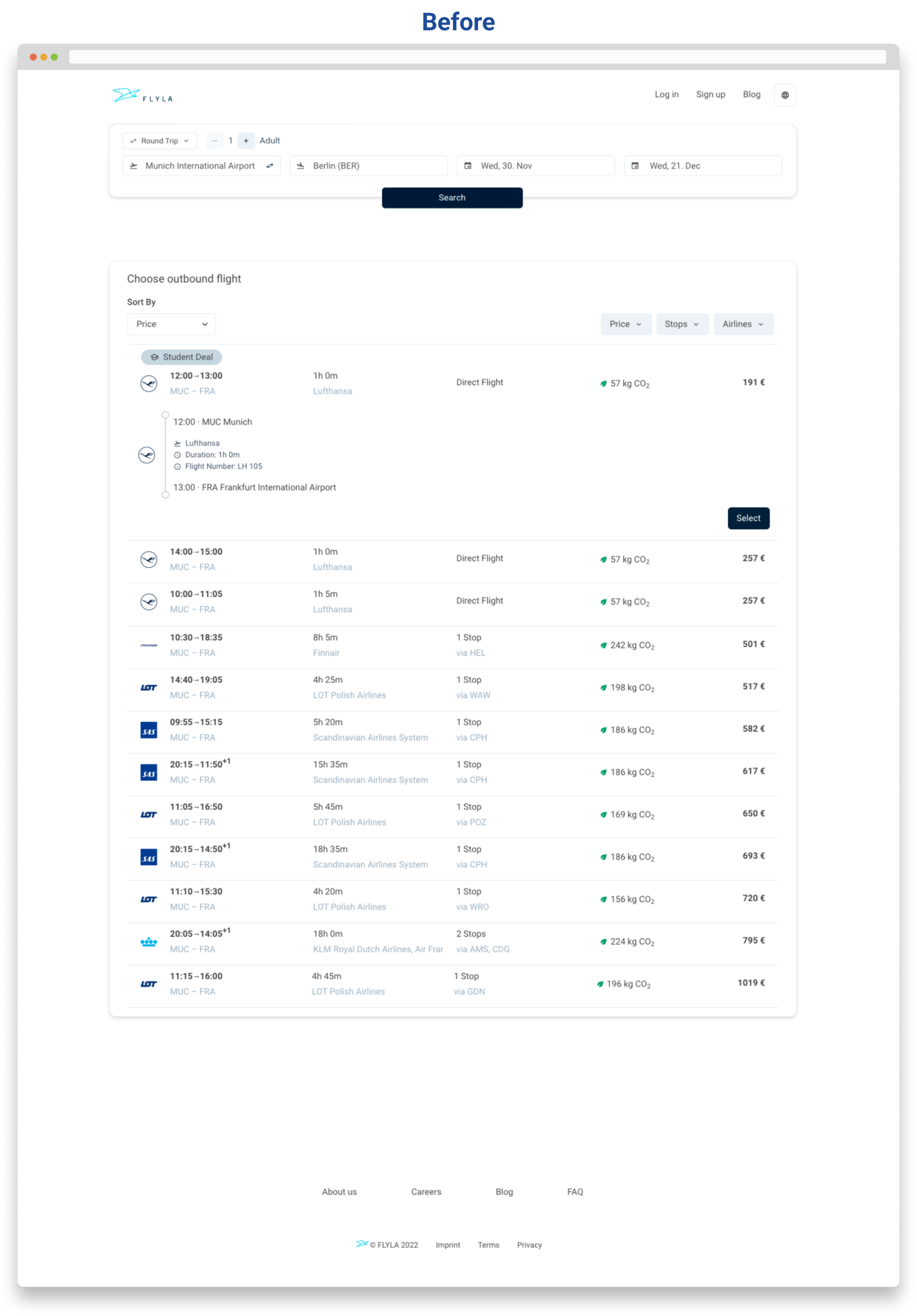
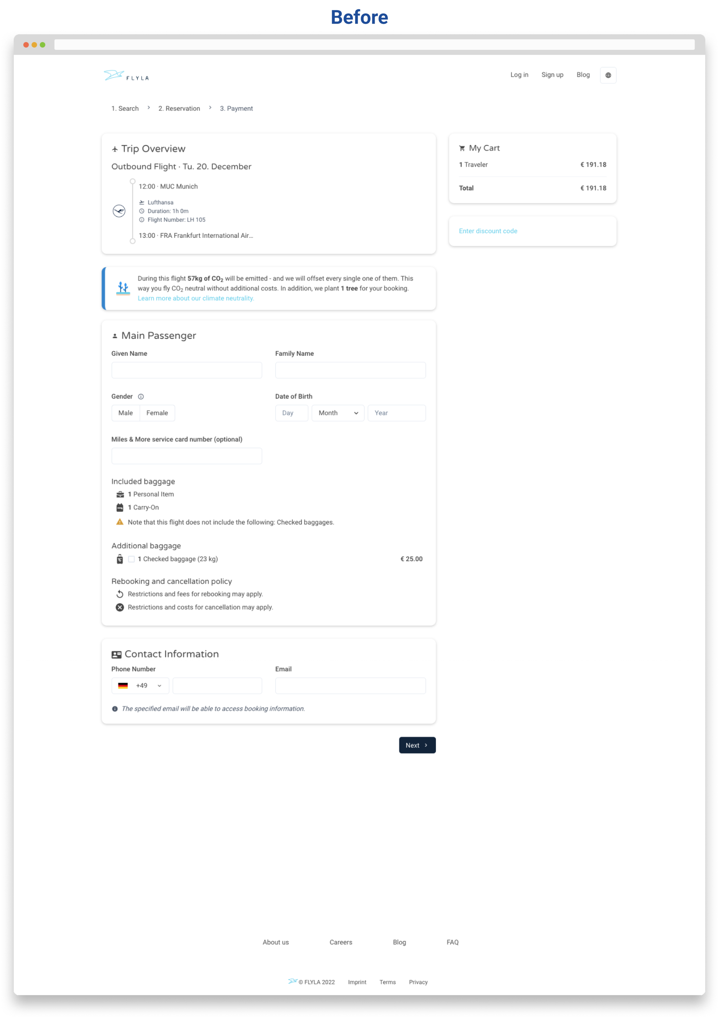
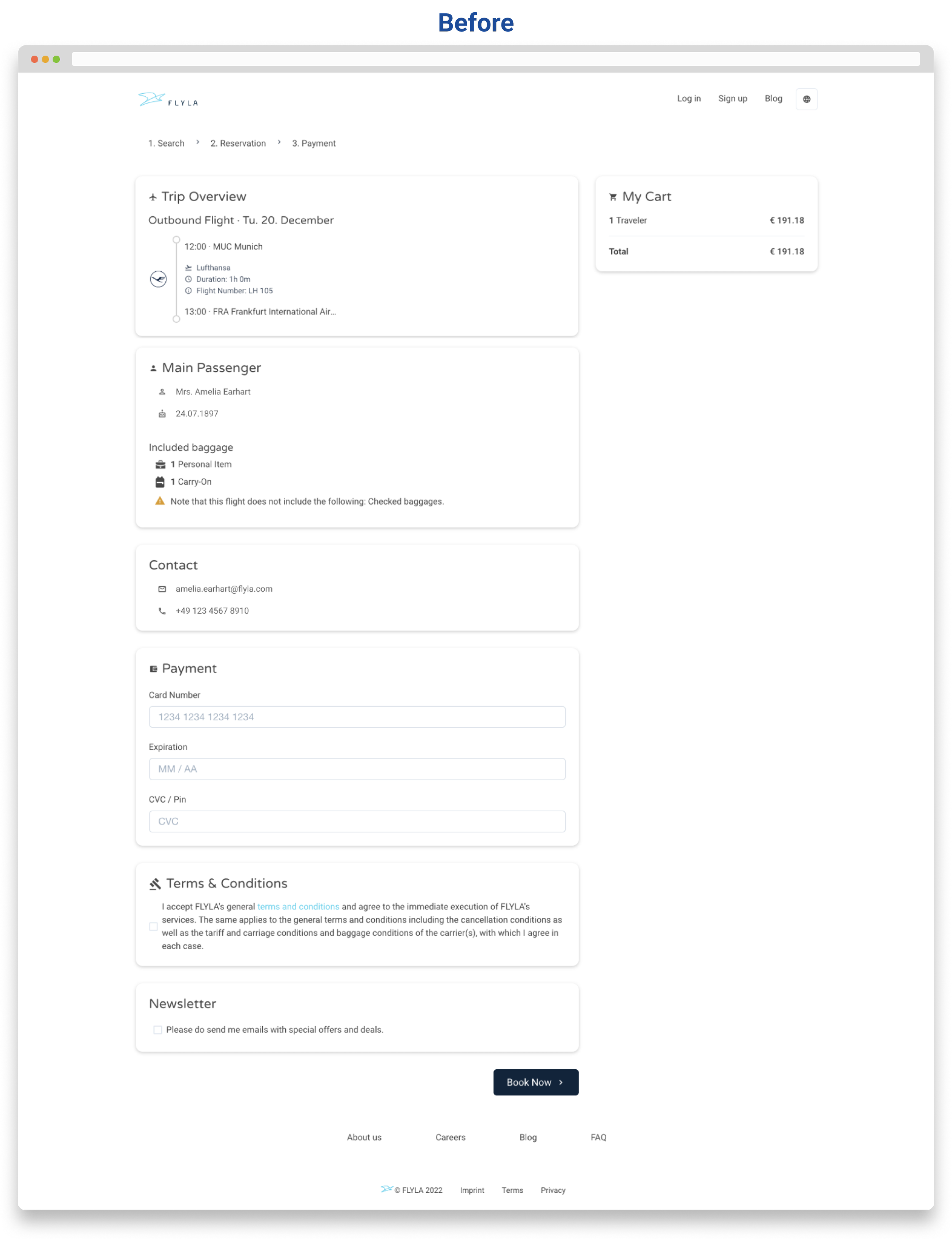
The challenge of this project for me as UX/UI Designer, has been to redesign Flyla both for desktop and mobile, taking into account the existing product due to the need to optimize resources and streamline the development process but at the same time having to constantly adapt to changing product changes in a pressurized environment and with a team that did not count with any designer (later on a product manager would be incorporated to the team).
UX Redesign: step by step
1. Understanding the existing users
To start with the UX redesign, I put the focus on user research and analytics. Having a website that users are using, already gives a bunch of useful information. In this way I used the analytics to understand how users were using the product and to ultimately identify the biggest pain points that they could be encountering and that for example, could be making them drop off in certain pages. This, together with the data gathered from surveys, user interviews and usability testing, I could already formulate where to possibly put the focus of the redesign,
2. Understanding Flyla goals
It’s essential to understand what the business part of Flyla wanted to get out of the redesign. What did the stakeholders know about Flyla existing users that could help me conduct the redesign? The UX redesign solution should be specific to the business’ goals while keeping user needs in mind. In this way, the user experience was meant to be designed to support those goals by making it easier and more beneficial for users to do those things.
3. Understanding the competitors
Taking a look at possible competitor’s sites gives us lots of information too. Not only can we analyze their UIs to understand what is working and what's not but also we can get inspiration on possible innovative solutions that we can borrow.
4. Analysis
In this phase I extracted insights from data collected during the previous phases, moving from “what” users wanted/thought/needed to “why” they wanted/thought/needed it. Basically I tried to confirm that all our most important assumptions were correct.
In order to empathize with our real users, I created an archetypical Flyla user whose goal and characteristics represent the needs of a larger group of users, as well as creating user stories that could help our team to understand the product interactions from the user’s point of view.
5. Design
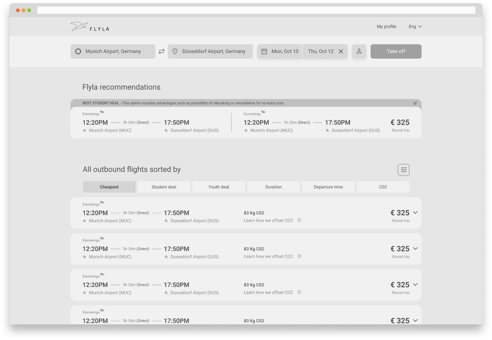
When all users' needs and all the expectations from a product were clear (or at least as clear as they could possibly be with constant changing needs), I moved to the design phase. In a first step wireframes and prototypes were created to test and agree on general directions and to clarify content blocks and fix the structure of the website.
To facilitate the work within the team, I created a design system that I set up in Figma to easily apply changes throughout the process.
6. Validation (testing)
Validation is an essential part of the process, in my opinion the most important. Here is where you understand whether the design works or not for the users. I always try to validate the product with high-fidelity prototypes to avoid confusion because testing with high-fidelity designs provides way more valuable feedback from end-users.
In this way, I conducted lots of moderated and unmoderated usability testing. Using for the unmoderated testing different market tools like Userbrain, Userzoom and Trymata that provided in a quick and efficient manner with valuable feedback from target users.
In the validation phase, I also conducted A/B testing, which basically is a simple experiment where users were shown two variants of a design to find out which one performed better.
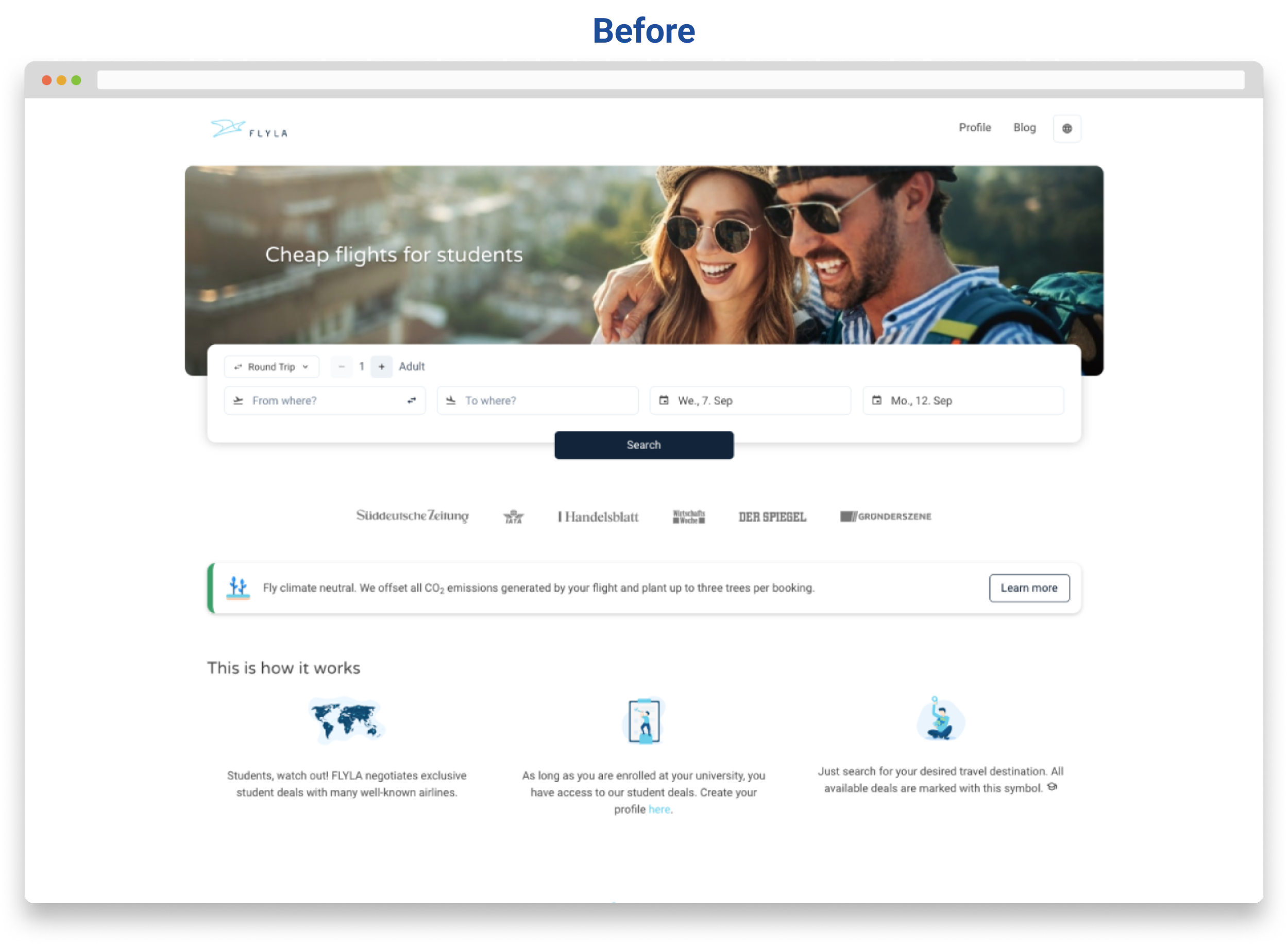
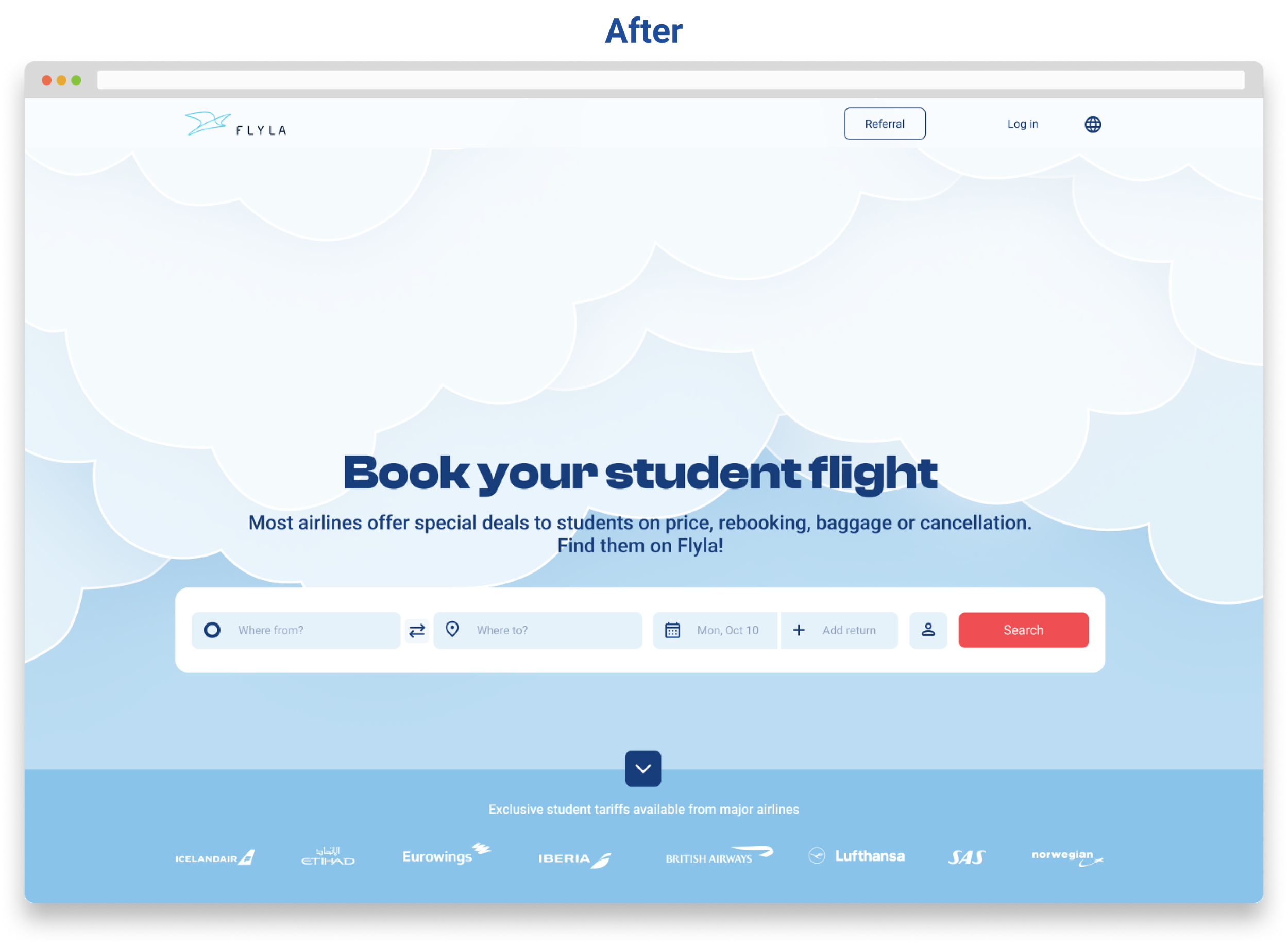
The UI Redesign
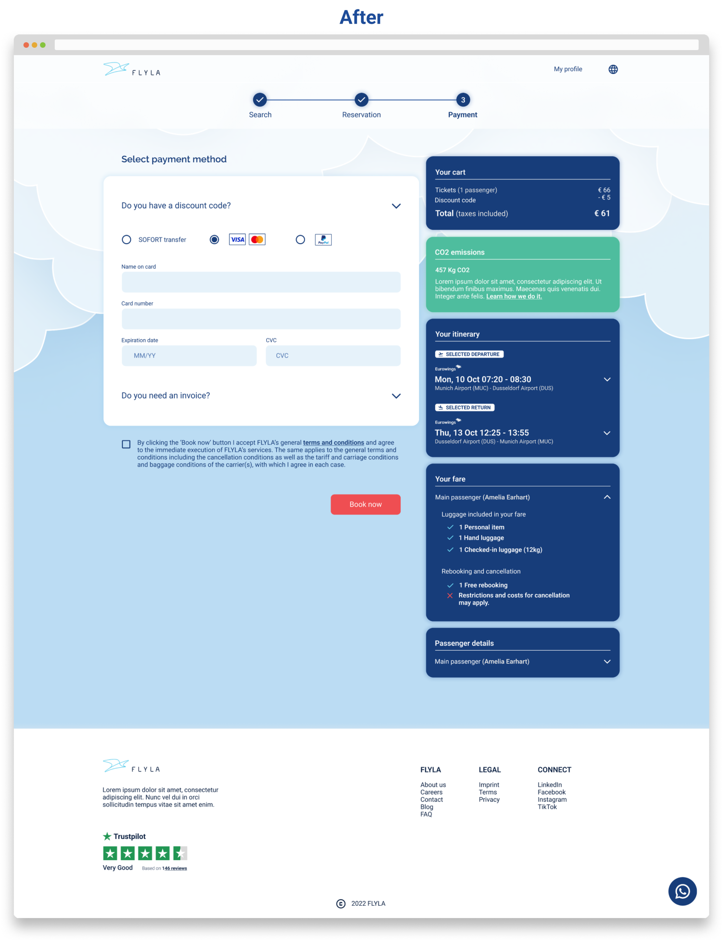
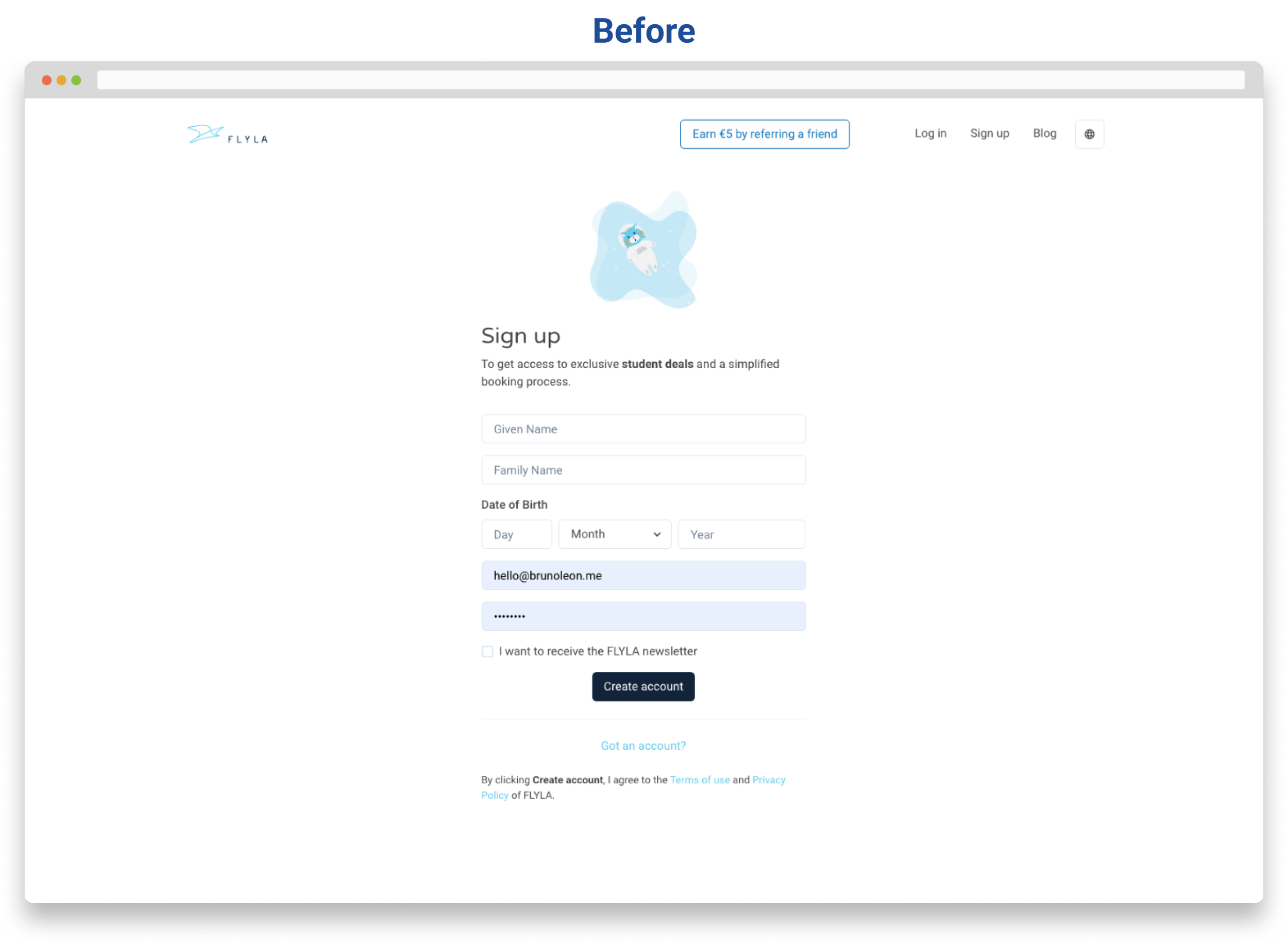
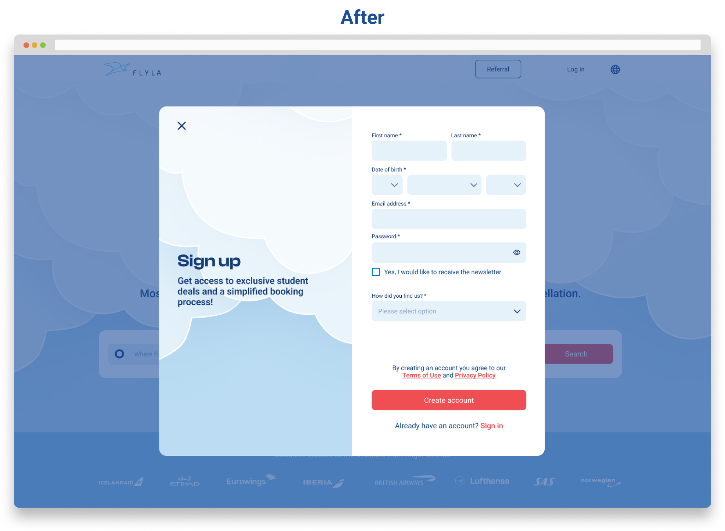
The goals of the redesign were to completely revamp Flyla's look, to create an attractive and straightforward design that connects with the generation z and and to improve the user experience by eliminating all existing elements of frustration.
